Monday, 29 April 2013
Wednesday, 24 April 2013
Prep work!
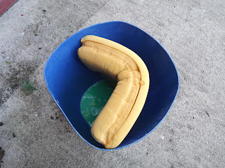
Mindmaps and thumbnail sketches to develop ideas and a concept... Currently making a mould of the Ballpoint Bic.
The ballpoint pen
Iv'e been playing around and trying to practice some photoshop techniques that I've been thought in Tuesday morning classes.
I choose certain dates and words that I think are most important to the ballpoint pen. biro brothers, 1935, bic, 1952 and of course ballpoint.
I choose certain dates and words that I think are most important to the ballpoint pen. biro brothers, 1935, bic, 1952 and of course ballpoint.
Tuesday, 16 April 2013
New project!!
So as we finished up our last project, our letter forms were put on exhibition today and everyone has been given a new brief. Celebrate ordinary objects by designing a poster and tagline for the object. Celebrating its qualities and showing 'visually' how wonderful it really is, (perhaps not let it be taken for granted!!)... We were all given different everyday object, from a pencil to a disposable razor to tape.... I picked ('from a hat' - or more a box) the ballpoint pen.
And so I have researched the history behind it and how it has been manufactured, Iv'e come across its design faults throughout the years and why it was even invented.
1935-The Biro brothers originally came up with idea to have a pen that one did not need to top up with ink so often, trying to get rid of the fountain pen, that could ofter be very messy leaving smudges on ones page.
Eventually Marcel Bic brought out the ballpoint bic in 1952, a fully functioning pen (with practically no design flaws), that is hugely popular today. A household utensil.
Monday, 15 April 2013
Finished piece for exhibition
Here is my finished letter form. A for absorbed, my concept was theat as a nation we have become so absorbed by the current state of the country's finances, which in turn has lead us to become people who are very much concerned for ourselves. 'looking out for No.1' I placed a mirror in the middle, so it has evolved into self-centered.
I felt the back needed compliment the absorbance of the letter at the front and so the back reflects the soakage. The letter form is poping out.
Tuesday, 9 April 2013
An Absorbed nation
My concept behind this word is that during the celtic tiger, people became obsessed with money and material objects. Caught up in our apperance both apperance and lifstyle.
Now people have become obsessed with the recession. A nation of self absorbed beings!!
The stages or steps cut out of the original full form A are to convey the sense of absorbion, the letter is soaked up. The Mirror is placed in the middle to give the self centered aspect, anyone who is standing infront will inevitably see themselves looking back.
during the Easter break
After trying to get inspired, snapping some more, in order to come up with a better, more effective concept with the word ASUNDER I decided that I would work with ABSORBED instead and began to brainstorm....

Took these photos when I was still thinking on the word ASUNDER. The letter form has fallen, is broken! - more tham one part.

Took these photos when I was still thinking on the word ASUNDER. The letter form has fallen, is broken! - more tham one part.
Subscribe to:
Comments (Atom)


