Eventually I have come up with a couple of posters which celebrate my object, the Ballpoint Pen!!
I'll choose a final design in the morning and also photocopy a few pages from my journal and I will be all set for my assessment on Monday afternoon.
Wednesday, 8 May 2013
Friday, 3 May 2013
And the year is almost over!
With the poster project ended it's surreal to think first year is nearly done with! finished!!... mad!!
The poster designs have been completed and printed, well everyones except mine. One of my tutors has given me till Wednesday, because I had been missing for a week due to a virus. She is giving me the time to work on my ideas and design so I can print my poster on Wednesday.
The poster designs have been completed and printed, well everyones except mine. One of my tutors has given me till Wednesday, because I had been missing for a week due to a virus. She is giving me the time to work on my ideas and design so I can print my poster on Wednesday.
Wednesday, 1 May 2013
ideas for the ballpoint pen - celebrating an ordinary object
After I talked about the British Air force and American flyers having an interest in the ballpoint when it first appearedn and discussed why, I was suggested to look at the difference between the ballpoint pen and the one it took over from, the fountain pen. To see what was used back then, and what is used now. The nibs, the ink to cartridges and leaky tools to smooth flowing biro.
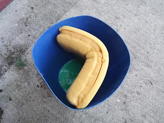
The ball in the biro is the most dominant change, allowing the ink to flow securely through, onto the page without smudge or smear. So as part one of the brief I began making a mould from plaster of paris of a generic ballpoint pen. Then I had decided to emphasise the ball and spray painted marbles and a bauble with silver crome spray.
The ball had also been described as a metal sponge for the ink, so I spray painted a golf ball, with the idea of the its 'pore-like' exterior giving the impression of something thet would absorb!! (this is sounding alot like my last project!!)
However, I also thought of incorporating something to do with the air force and the pen originally. And after having a chat with one of the girls in my class I think I could come up with a better way of 'celebrating the ordinary object'. Combining an old air force plane with the sillohette of the biro, having it 'soaring up'!!
Monday, 29 April 2013
Wednesday, 24 April 2013
Prep work!
Mindmaps and thumbnail sketches to develop ideas and a concept... Currently making a mould of the Ballpoint Bic.
The ballpoint pen
Iv'e been playing around and trying to practice some photoshop techniques that I've been thought in Tuesday morning classes.
I choose certain dates and words that I think are most important to the ballpoint pen. biro brothers, 1935, bic, 1952 and of course ballpoint.
I choose certain dates and words that I think are most important to the ballpoint pen. biro brothers, 1935, bic, 1952 and of course ballpoint.
Tuesday, 16 April 2013
New project!!
So as we finished up our last project, our letter forms were put on exhibition today and everyone has been given a new brief. Celebrate ordinary objects by designing a poster and tagline for the object. Celebrating its qualities and showing 'visually' how wonderful it really is, (perhaps not let it be taken for granted!!)... We were all given different everyday object, from a pencil to a disposable razor to tape.... I picked ('from a hat' - or more a box) the ballpoint pen.
And so I have researched the history behind it and how it has been manufactured, Iv'e come across its design faults throughout the years and why it was even invented.
1935-The Biro brothers originally came up with idea to have a pen that one did not need to top up with ink so often, trying to get rid of the fountain pen, that could ofter be very messy leaving smudges on ones page.
Eventually Marcel Bic brought out the ballpoint bic in 1952, a fully functioning pen (with practically no design flaws), that is hugely popular today. A household utensil.
Monday, 15 April 2013
Finished piece for exhibition
Here is my finished letter form. A for absorbed, my concept was theat as a nation we have become so absorbed by the current state of the country's finances, which in turn has lead us to become people who are very much concerned for ourselves. 'looking out for No.1' I placed a mirror in the middle, so it has evolved into self-centered.
I felt the back needed compliment the absorbance of the letter at the front and so the back reflects the soakage. The letter form is poping out.
Tuesday, 9 April 2013
An Absorbed nation
My concept behind this word is that during the celtic tiger, people became obsessed with money and material objects. Caught up in our apperance both apperance and lifstyle.
Now people have become obsessed with the recession. A nation of self absorbed beings!!
The stages or steps cut out of the original full form A are to convey the sense of absorbion, the letter is soaked up. The Mirror is placed in the middle to give the self centered aspect, anyone who is standing infront will inevitably see themselves looking back.
during the Easter break
After trying to get inspired, snapping some more, in order to come up with a better, more effective concept with the word ASUNDER I decided that I would work with ABSORBED instead and began to brainstorm....

Took these photos when I was still thinking on the word ASUNDER. The letter form has fallen, is broken! - more tham one part.

Took these photos when I was still thinking on the word ASUNDER. The letter form has fallen, is broken! - more tham one part.
Thursday, 21 March 2013
Confusion...
So today I was drawing thumbnails
of the things associated with the words anarchy and asunder, (to try and get
ideas, good ideas, rolling).
I'm not so sure about how
productive it was, but I did decided to go with the word asunder, with the
image of the letter falling apart! My thoughts were that anarchy was too
obvious and generic of a word to deal with this particular theme!
After a chat with one of the
tutors, I'm not so sure about what I have been doing, which is good in one
sense, at least now I know I need to push things a lot more... but I was VERY
and am now a bit confused as to what I should do next.
Her thoughts were that anarchy will
be too difficult. She explained to me that the task is not to be illustrative
and stressed the point that I must concentrate on the letter form itself to
convey the message/word.
[ I used photo shop (not too
well) to layer coins on top of one another, leaning inwards to try and create
the form of A.]
Got interrupted yesterday, the
college was closing and as my laptop is out of action I had to return this
morning and finish what I wanted to blog yesterday.... It was suggested to me
that perhaps I change my word. Look at absorbed and relate it to the brief!! At
first I wasn't sure and told my tutor I was going to stick with asunder. She
explained that I could get something really interesting out of it, but I stood
on the whole asunder theme!!
However, I was thinking it over
last night, did a brainstorm, generated some ideas and now I'm thinking it was
pretty good advice. Absorbed... How we the people had become a nation of
materialistic mofos and now during the recession have become absorbed by the
lack of money. Absorbed with our own self, ones wellbeing.
Making my letter form out of
sponge and have it seeping back into it was a suggesting, a good one, suggested
to me yesterday. I definitely think there is something there.
I'm going to develop my ideas
over the next 2 weeks, during Easter holidays and when I come back I will have
not only the word but the whole idea and be able to work on perfecting it for
that week
Tadashi Kawamata
http://www.tk-onthetable.com/
Luke, one of the guys in the class introduced me to Kawamata. I was drawing thumbnail sketches and some were of scaffolding, broken walls and building, (for the word Asunder).
Luke, one of the guys in the class introduced me to Kawamata. I was drawing thumbnail sketches and some were of scaffolding, broken walls and building, (for the word Asunder).
Tuesday, 19 March 2013

Had a photoshop class this morning and I've a way better understanding of how to use it. These were the random pics I took on my walk at the weekend, after some of them were played around with on the handy program.
We also availed of a lens based media talk from a film directer / photographer Conor Horgan this morning in the Moylish LIT campus. I found it really insightful and enjoyed watching what he had worked on. http://vimeo.com/conorhorgan
Back to work after the bank holiday weekend..
So I was out sick Wednesday and Thursday last week and as a
result didn't get an lot of work done. I was feeling better by Sunday and
decided to take my camera on a walk around the town. Initially I was hoping to
capture photos that would show, in some way, something, anything at all about
the country!! I took photos of unfinished housing estates and road works that
have been left abandon due to the economic climate, buildings under construction and others that have been neglected, which has lead to their deterioration. I then started taking
photos of groups of young adults/teenagers, thinking of them as being 'the hope for the future'
(cheesy I know). That didn't go on for too long though. I felt some of them may
get a little bit offended if they spotted me... I chickened out. So I ended up
just taking snaps of things that appealed to me on my way back.
When I got home I decided to play around with making the letter A from both words, Asunder and Anarchy. For Asunder I cut out the shape of the letter and began sticking bright happy pictures on the front solid side and made it fall apart as it rotated around to the far side, which has dark, more depressing photos depicting a 'broken' county along with negative newspaper headings, relating to the nation.
For Anarchy I was thinking of weapons. Like mobs of people attacking the government, going mad altogether. So I went out to the garden and broke branches and twigs off trees at an angle to try make them look sharp at the tops, like spears.... (It didn't translate as well as I'd hoped, was very ethnic-y looking with a hint of blair witch!)
Subscribe to:
Comments (Atom)


